Table of contents
Folded into a lobby rack or slipped into a room key sleeve, a complimentary map can look like a quaint throwback, yet in 2026 it still speaks volumes about how a hotel imagines its neighbourhood, who it thinks its guests are, and what it wants them to do once they step outside. As Paris braces for another packed cultural calendar and sustained tourist demand, those paper choices, the routes highlighted, the language used, the businesses listed, quietly become editorial decisions with commercial consequences.
Maps are a hotel’s first editorial choice
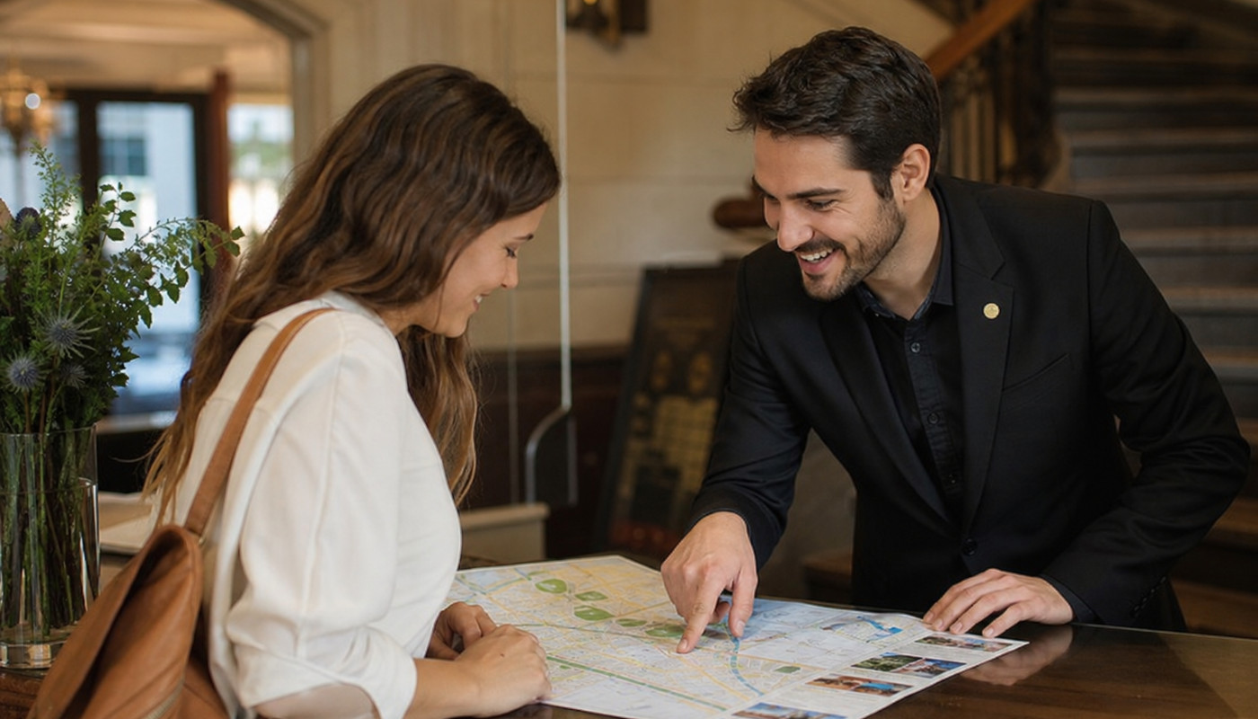
What does a hotel “publish” the moment you arrive? Before the breakfast briefing and long before a concierge’s recommendations, the map on the counter is often the first piece of content a guest consumes, and like any publication it has a line, a tone, and a target audience. The simplest signal is format: an official Île-de-France Mobilités plan prioritises RER lines and transfer logic, while a stylised neighbourhood sketch pushes strolling and serendipity, and when a property provides both, it is effectively telling you it caters to two tempos of travel, the commuter’s and the flâneur’s.
Language is another reveal. Hotels that print bilingual or trilingual maps are not only anticipating foot traffic from specific markets, they are deciding which visitors to serve first, and which to leave translating on their phones. Even the typography is a clue, because a dense legend and small type suggest a guest willing to decode, while clean icons and sparse labels hint at short stays, families, or travellers who want fast wins. In an era when location-based recommendations are dominated by platforms, a hotel map is one of the last spaces where a property can set the narrative without an algorithm; the trade-off is responsibility, because once you make a route feel “official”, guests will follow it, and judge you on it.
There is also a business model embedded in the ink. Some maps function like curated guides, others resemble quiet advertising sheets, and the difference is not always obvious to a jet-lagged reader. A map dotted with partner cafés and shops can be genuinely useful, yet it also raises questions: were these addresses selected for quality, proximity, commission, or convenience? The most credible hotel maps, the ones that feel like journalism rather than marketing, tend to be explicit about scope, highlighting essentials first, then adding recommendations with a clear voice, and leaving room for the guest’s own discovery. Put bluntly: a map is not only directions, it is a hotel’s worldview, compressed to A4.
What gets highlighted shows who matters
Look at what is made visible. A map that foregrounds major monuments, the Louvre, the Eiffel Tower, Notre-Dame, is speaking to first-timers and short-stay visitors, and it is implicitly promising easy access to postcard Paris. A map that foregrounds parks, markets, libraries, swimming pools, or sports facilities is often tuned to longer stays, families, repeat visitors, and business travellers looking for routine. The most telling choice is what is omitted, because omission is a form of editing: is the nearest métro station clearly labelled, are walking times mentioned, are late-night transport options indicated, and does the map acknowledge accessibility constraints, steep streets, or stair-heavy transfers that matter in real life?
In Paris, those details are not minor. According to official figures, Île-de-France Mobilités recorded roughly 3.4 billion journeys on the region’s transport network in 2023, a scale that makes public transit the true backbone of visitor mobility, and a hotel map that treats the métro as an afterthought is arguably misreading how guests actually move. Likewise, a map that marks only tourist attractions can be less helpful than one that points to daily needs, pharmacies, supermarkets, laundries, medical centres, and safe late-night routes. These are unglamorous pins, yet they are the ones that shape the feeling of being looked after.
The neighbourhood lens matters just as much. A hotel in the south of Paris, for instance, may choose to anchor its map around connections to Gare de Lyon, Orly, or the Left Bank, emphasising commutes and access, while another may frame the area as a destination in itself, pointing to local art venues, riverside walks, or food streets. That approach is more than aesthetic, it affects guest behaviour, and therefore local economies, because when a hotel steers footfall toward independent businesses rather than only the city’s most saturated landmarks, it spreads spending, and it also reduces the disappointment that can come from overhyped “must-sees”. For travellers weighing value and convenience, a map that takes the 13th arrondissement seriously, not as an afterthought but as a lived district, can be a sign that the property has a grounded local vision, especially when it pairs transport clarity with genuine neighbourhood intelligence, as you would expect around a 3-star hotel in Paris 13th.
Paper maps still compete with Google
Why offer paper at all when every phone carries an always-updating map? Because paper does something screens rarely do well: it gives context at a glance. A smartphone tells you where you are, but a well-designed printed map can tell you what the hotel thinks is worth seeing, how areas relate, where time is likely to be lost, and which choices will make the day smoother. That overview becomes more valuable when visitors are overwhelmed by options, and Paris is the archetypal city of infinite choice, where the cost of a wrong turn is not only time but mood.
There is also the question of trust. Digital maps excel at navigation, yet they can be poor at judgment, and their recommendations are shaped by popularity signals, paid placements, and feedback loops. A complimentary hotel map, when it is done well, is closer to a newsroom brief: it can prioritise what is reliably open, what is realistically reachable, and what matches the traveller’s likely constraints. This is where small details matter, such as indicating typical walk times, flagging areas that are lively late, or suggesting an alternative scenic route instead of the shortest one. Even a simple note, “busy at peak hours”, can save a guest an hour and a headache.
Paper also has a behavioural advantage: it invites wandering. A folded map on a café table makes it easier to plan collectively, to point, argue, laugh, and decide, while phones can splinter a group into parallel solo searches. For couples, families, and friends, the physical object becomes a shared interface. Hotels that understand this tend to print maps that are not merely functional but pleasurable to use, with readable scale, clear landmarks, and a layout that respects tired eyes. When a map is designed for real hands rather than screenshots, it signals a hotel that has watched guests move through a day, and learned from the friction points.
A good map hints at the stay’s real value
Complimentary maps can also reveal how a hotel defines “value”, and not only in price terms. Does the map help you spend less by highlighting affordable eateries, public gardens, and free viewpoints, or does it steer you toward high-ticket experiences? Does it point to cultural sites beyond the obvious, such as a local museum, a contemporary gallery, or a neighbourhood library with an exhibition programme, or does it treat culture as a list of famous names? The more varied the pins, the more the hotel is admitting a truth that seasoned travellers know: memorable trips are built from small moments, not only headline attractions.
That is why practical information, often ignored, becomes a form of care. A map that indicates where to buy a carnet alternative, where to catch an airport bus, how to reach a major station without unnecessary changes, or where to find a 24-hour pharmacy, is quietly building trust. The same applies to honesty about distances. Paris looks compact on a screen, yet walking from one “nearby” spot to another can take longer than expected, particularly with crowds, heat, or rain, and when a hotel map marks walking times, it is taking the guest’s energy budget seriously. For business travellers, that can mean catching a meeting; for leisure travellers, it can mean not spending the evening disappointed and hungry because the “quick walk” turned into an hour.
Finally, the map signals whether the hotel is confident in its immediate surroundings. Properties that highlight their own block, the nearest métro, and a short list of tried-and-tested addresses are effectively saying, “Stay close, it’s good here.” Those that only point outward, toward central Paris, may unintentionally imply that the neighbourhood is merely a sleeping base. In competitive parts of the city, especially districts that are sometimes undervalued by outsiders, a map that frames local life, food, parks, and transport with clarity can be an understated differentiator, and it can shape how guests talk about the area afterward. In the end, a complimentary map is a promise on paper: not just where you can go, but what kind of city the hotel believes you came to experience.
Before booking, read the map like a contract
Ask for the neighbourhood map before you reserve, compare walking times to the nearest métro and key hubs, and budget for transit if the hotel frames the stay around connections. Look for clear routes to stations and airports, and check whether local discounts, museum passes, or transport advice are mentioned. If you are eligible, factor in any employer travel policy or available tourism offers that can offset costs.
Similar articles

The Influence Of Cannabis Culture On Fashion Trends

Asia: a new destination for favorable and fruitful investments

What distinct cultural treasures are France and Texas home to ?

4 advantages of going on a cycling vacation in France

Why is Aviator 1xbet worth playing?

Why work with someone who invests in real estate ?

What is the importance of a coupon code?

How to sell your house?

Tongue drums: what to remember in Finland

Things to Know About Bookmarks

Find the right performance for digital marketing and business creativity

Pros and Cons of Kids' Headphones

What activities can you do in Mont-Saint-Hilaire?

How to buy laptop charger through online selling platform

Why and how to choose a watch case?

Why buy second hand ?

Why do I have to fill in the passenger locator form before entering Greece ?

How to make a project successful?

Why vaccinate against covid19 ?

How to make your workout session more effective

How do you go about disarming the home alarm without resorting to the code?

Credibility of information: What to know?

How to know the estimated payment of the house?

How to take care of your car on a daily basis?

Tips for feeling comfortable during an interview

Find Your Pet Poster to edit online

How to install a bathroom toilet ?

What should I know about solar pool heating systems ?

What to do when you find a cat ?

The benefits of advertising on Facebook for affiliate marketing

Wooden decking and concrete decking: what to choose?

What are the criteria for selecting a winter coat ?

Our tips for creating a chatbot in Facebook-Messenger

Musculation-food: what you need to know before you start

Why buy second-hand goods ?

What are the needs that guide the choice of a sofa bed?

The importance of support belts after childbirth

What do I need to know about Bitcoin?

Income tax in France: what knows ?

What is the meaning of Namaste?

VISITAX for your trips to Quintana Roo

Business website attack: how to be prepared

Creating a chatbot on Facebook: the essentials to know

To the discover of cloud telephony

Smartphone Airplane Mode: Some Benefits That May Surprise You
